By Wayne
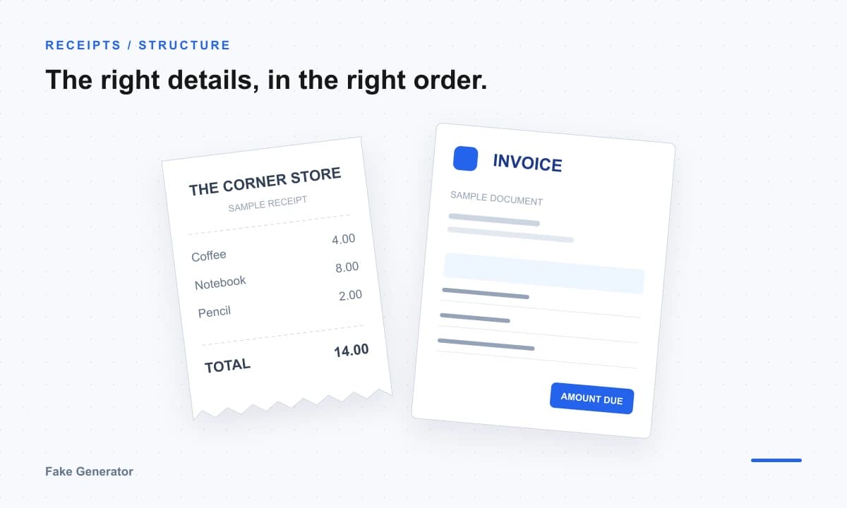
A receipt mockup is easier to build when you choose the right structure first. A retail purchase, a taxi trip, and an invoice can all include a date and a total, but they organize the surrounding information differently.
For a design demonstration or a sample document, start with the information your reader needs to understand. Then choose the layout that makes that information easiest to find.
Match the document to the scenario
A receipt typically records a payment. An invoice typically requests payment and may include a due date or payment terms. Their exact contents vary by business and location, so use the terminology that matches your example.
| Document | Main information | Typical layout |
|---|---|---|
| Retail receipt | Store, purchased items, taxes, total, payment | Narrow itemized list |
| Trip receipt | Journey details, date, fare, additional charges | Trip summary and fare breakdown |
| Invoice | Seller, customer, line items, due date, amount due | Wider document with clear sections |
A brand name alone does not determine the document type. The same business might provide a store receipt, an online order summary, and a separate invoice.
Start with the sections you need
For a retail example, the Free Receipt Generator lets you build a document from editable sections. The Walmart Receipt Generator provides a more specific starting layout.
The Receipts collection contains store receipt layouts built with the same editor. Payment mockups and test card data are in Documents. Both collections list only implemented tools, ready to use.
Put identifying details near the top
The merchant name, address, transaction reference, and date help a reader understand what the document represents. Keep these details grouped rather than scattering them between line items.
Use sample information that fits the scenario. A fictional neighborhood shop may need a short address and an order number; it probably does not need every field found on a large retailer's receipt.
Keep the item list easy to scan
Use concise item names and consistent quantities. If an item needs a longer description, check how it wraps before adding more rows.
Prices should remain visually distinct from descriptions. A clear column of amounts is easier to scan than prices embedded in a paragraph.
Check the amounts as a complete calculation
Review the subtotal, discounts, tax, additional charges, and final total together. A plausible-looking total is not enough if the displayed rows do not support it.
When the generator calculates totals automatically, adjust the relevant inputs and inspect the result. Check how the selected tool applies tax and discounts; different business scenarios can require different rules.
Do not assume that a visual mockup implements every accounting or tax requirement for a country. Choose a dedicated accounting workflow when you need an actual business document.
Choose spacing before decoration
A narrow receipt needs a different rhythm from a full-page invoice. Start with readable text, enough padding, and clear separation between the header, items, and totals.
Decorative separators, barcodes, and footer notes should have a purpose. Adding every available component often makes the result harder to read.
Try removing one unnecessary section before reducing the font size. A simpler document usually scales better.
Export and review the sample
Download a version and inspect the longest item name, the largest amount, and the bottom edge of the receipt. These are common places for a layout to become crowded as you add content.
If you plan to place the document in a presentation, check it at the intended display size. Keep the surrounding context clear that this is a sample, prototype, or creative mockup.
Once the structure works, save your example and reuse the same review process for the next template. Consistent fields and careful spacing make a bigger difference than adding more visual details.